Taylor Moon Flower Farm: Logo
LOGO · BRANDING
In early 2024, I was approached by Taylor of Taylor Moon Flower Farm to create a logo for her business – a flower farm based in Manitoba. Taylor emphasized that she was wanting her brand to lean more in the boho-inspired look, including physical emphasis on a crescent moon worked into the logo. Taylor was presented with two themed moodboards to select from – a more traditional garden-inspired palette, with lots of bright, natural colours and a moodier palette that leaned more into the boho-aesthetic she was looking for. Unsurprisingly, she selected the moodier palette in an effort to stay true to herself, and stand out amongst the flower farm community.
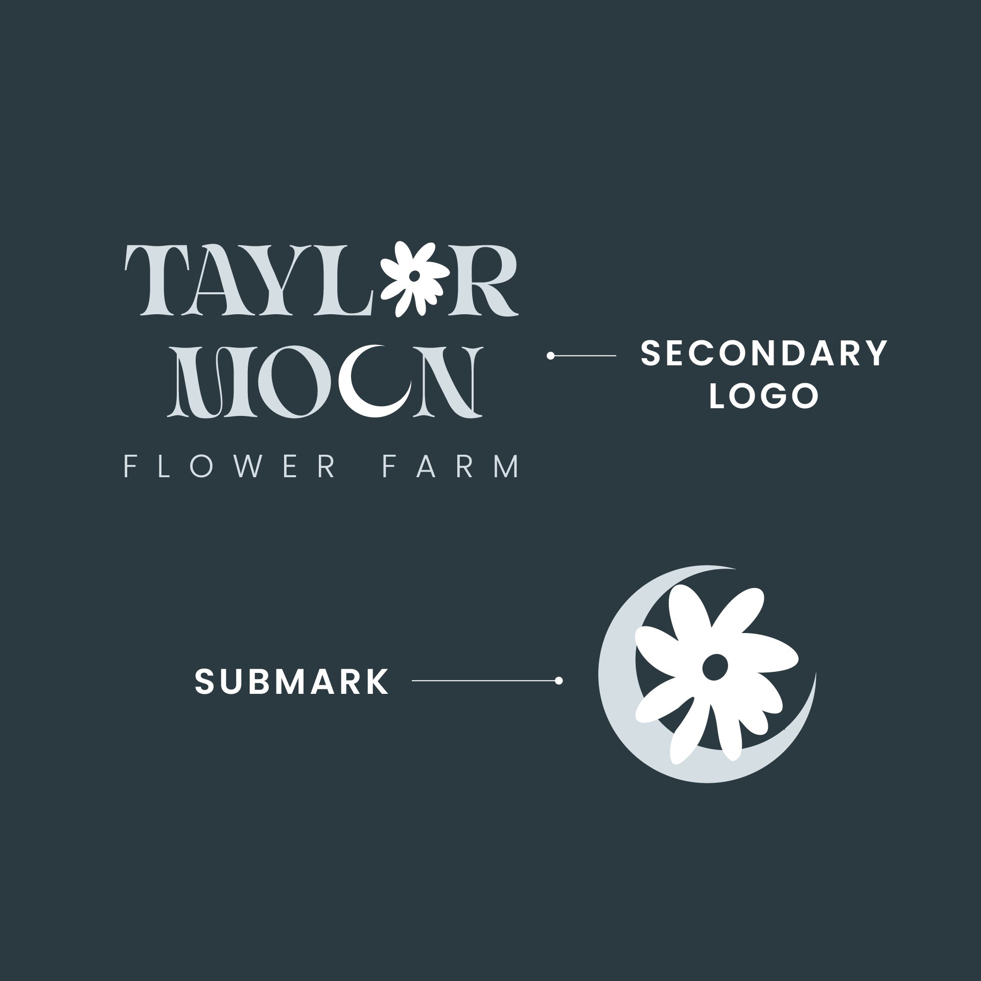
When drafting logo concepts, I knew that I wanted this logo to incorporate the crescent moon in the inspirational imagery that Taylor had sent to me. But additionally, it felt important to work in the flowers in a subtle way to clearly show, without reading the name, that this was a flower-based business.
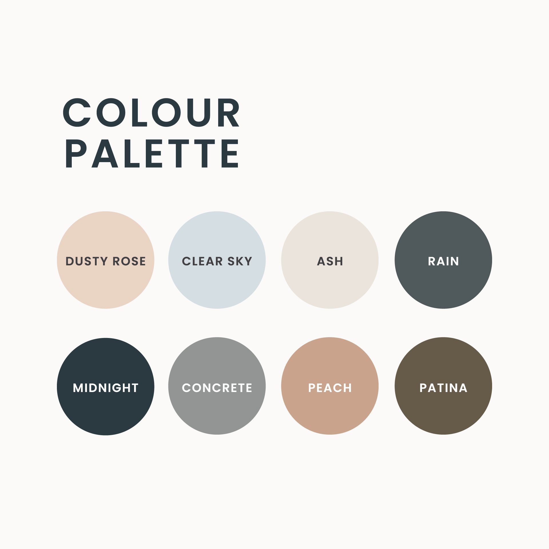
The font used within the Taylor Moon Flower Farm logo is Italigia, and I chose to accent this font with a simple, modern font, Poppins for legibility, professionalism & clarity. Given the amount of O’s featured in the business name, it felt appropriate to subtly work in the crescent moon to one of the O’s in moon, and a flower into Taylor’s name – a nod to both the flowers she tends to, and the crescent moon she feels so connected with. The colour palette of the brand still leans more natural, but was inspired by a gloomy, rainy day, instead of the typical bright pinks and greens of a sunny, hot summer day.


